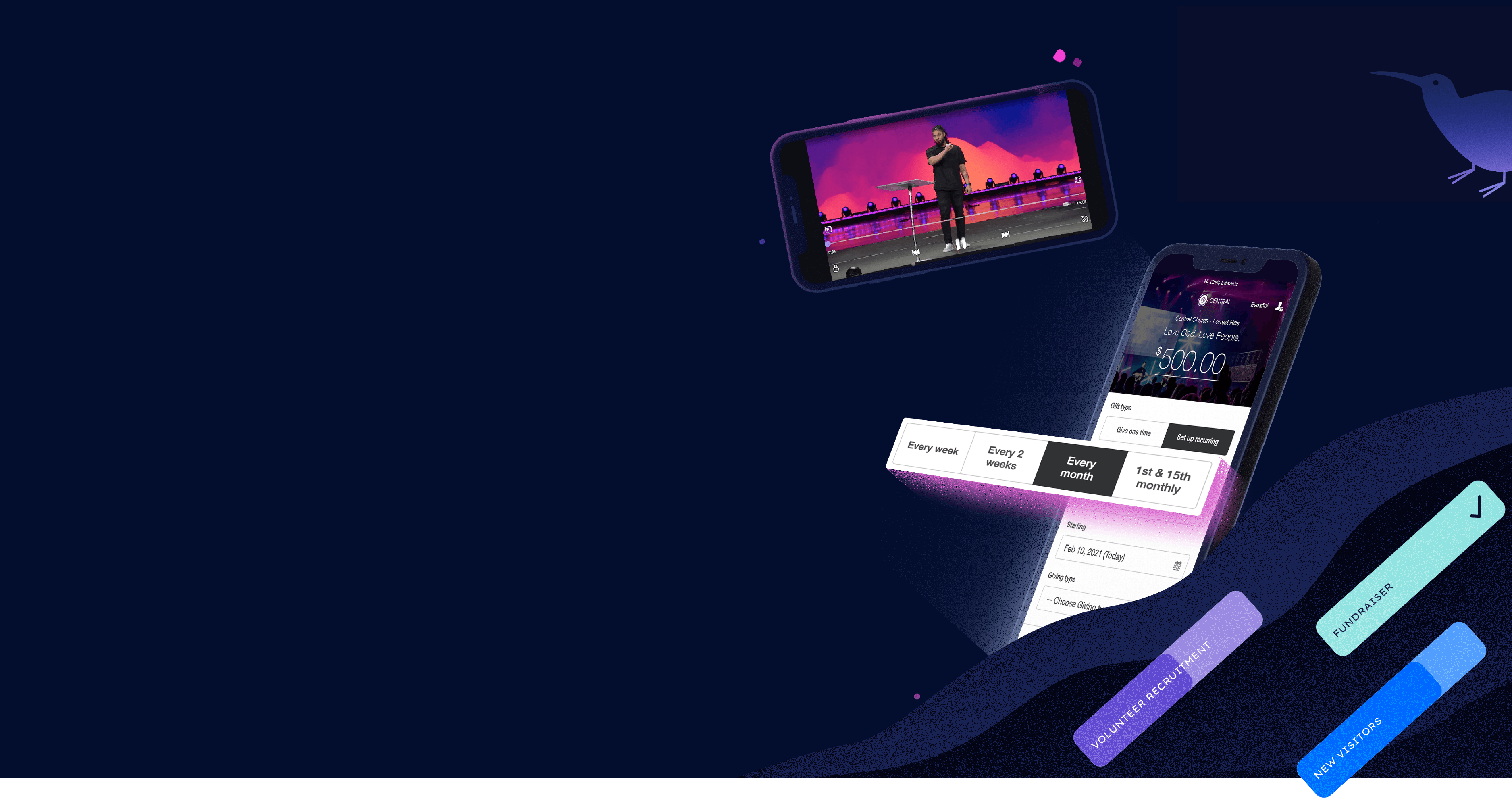
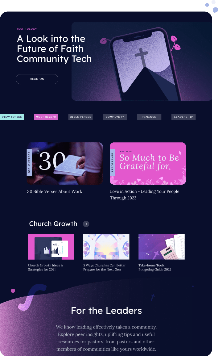
Micrographics are utilized throughout the site as positive points of interruption that communicate what a feature is FOR in a tangible way, and create deeper consumer understanding.
A Friend +
A Force
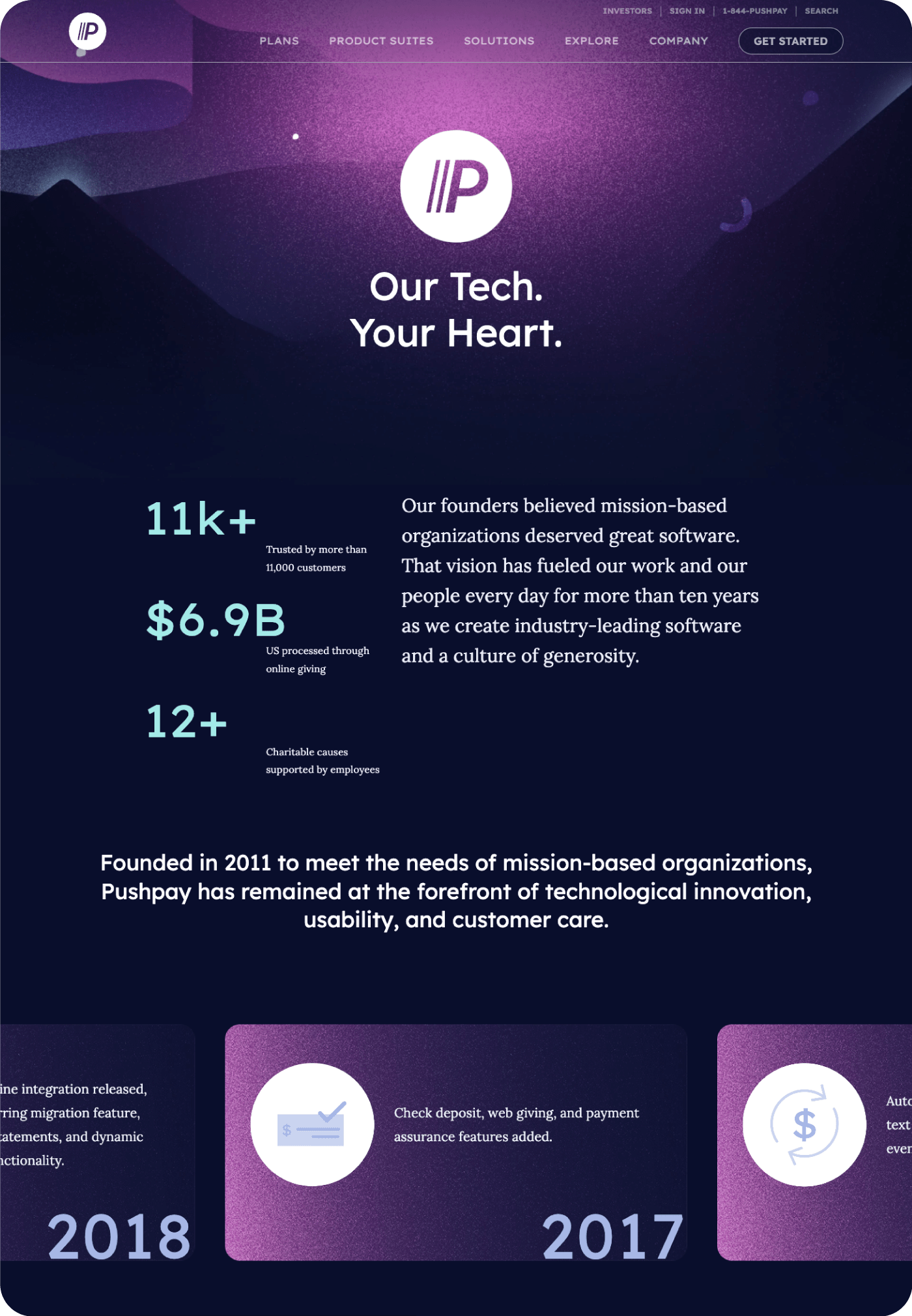
Pushpay is neither small nor corporate. How do you communicate that being involved with a company of their experience and scale is a soulful and enviable position? Highlight that their incredible reach is best used to lift up and provide a spotlight to their customers and partners. Associations between a positive lift and a universe of products and possibilities are nurtured by a site design that invites users to explore deeply, and Pushpay to test featured offerings.